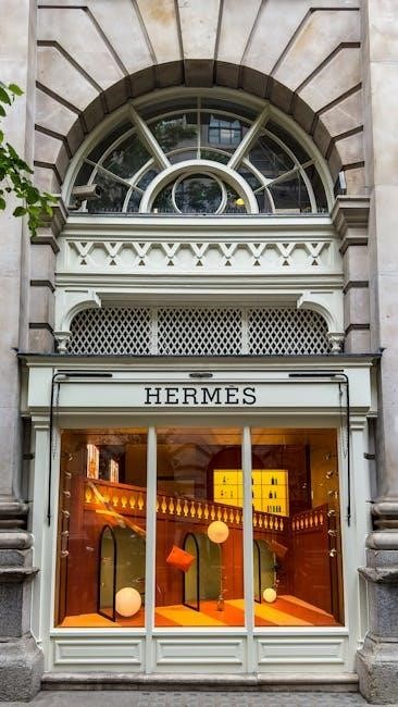
Hermès Color Guide: A Comprehensive Overview (Updated February 17, 2026)
Hermès color selection is a nuanced art, influenced by leather type and seasonal trends; Gold and Etoupe remain highly coveted, alongside vibrant options like Vert Anis and Violet.
Hermès colors represent more than just aesthetics; they embody a legacy of craftsmanship and discerning taste. The Maison’s palette is renowned for its depth, subtlety, and enduring appeal, attracting collectors worldwide. Understanding these hues requires appreciating how they interact with different leathers – Box Calf, Chèvre, and Togo, each displaying color uniquely.
From iconic neutrals like Gold and Etoupe to bolder seasonal shades like Vert Anis and Violet, the range is extensive. The interplay between color and hardware (Palladium or Gold) further enhances the visual experience, influencing the overall vibe. A careful consideration of these elements is key to appreciating the artistry behind each Hermès creation.
Understanding Hermès Leathers and Color Variation
Hermès leathers significantly impact how colors are perceived, creating subtle yet distinct variations; Box Calf offers a smooth, polished finish, displaying colors with clarity and vibrancy. Chèvre de Coromandel, with its fine grain and iridescence, lends a softer, more nuanced appearance, particularly suited for brighter hues like Vert Anis.
Togo leather’s texture adds depth, influencing color saturation. The same dye can yield slightly different shades depending on the leather type, a crucial detail for collectors. This complexity is what elevates Hermès beyond simple color matching, making leather selection a highly regarded skill.
How Leather Type Impacts Color Appearance

Hermès colors aren’t static; they interact with the leather’s inherent qualities. Smooth leathers like Box Calf showcase colors truer to their intended shade, offering a crisp, clean aesthetic. Conversely, textured leathers, such as Togo, absorb and reflect light differently, subtly altering color perception.
Chèvre de Coromandel’s grain creates a shimmering effect, enhancing vibrant colors like Violet. Even within the same leather, variations in grain and thickness can lead to slight tonal differences. Understanding this interplay is key to appreciating the artistry of Hermès color selection.
Popular Neutral Hermès Colors
Hermès neutral shades form the foundation of many collections, prized for their versatility and timeless appeal. Etoupe, a sophisticated blend of taupe and grey, has surged in popularity, aligning with current earth-tone fashion trends. It beautifully complements both Palladium and Gold hardware.
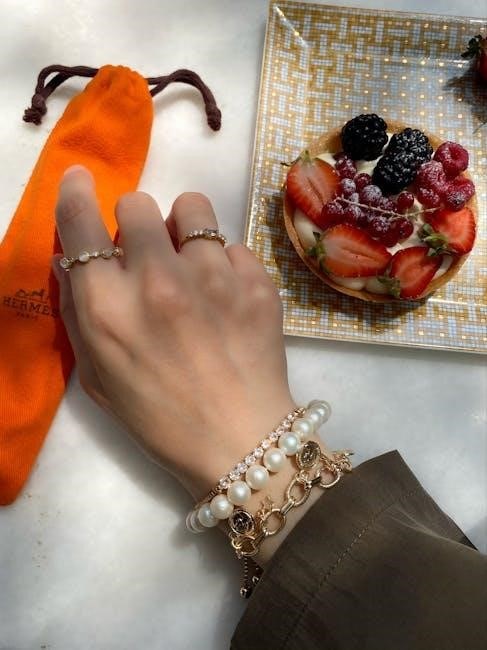
Gold remains an iconic choice, often paired with white stitching to accentuate its richness. The classic Noir offers enduring elegance, while other neutrals like Gris Perle provide subtle sophistication. These colors ensure a lasting investment piece.
Etoupe: The Versatile Earth Tone
Etoupe has become exceptionally popular in recent years, mirroring the broader fashion embrace of earthy tones. This captivating shade exists beautifully between taupe and grey, offering an incredibly easy-to-match aesthetic. Its versatility shines, subtly shifting its overall vibe depending on the hardware chosen – Palladium for a cooler tone, or Gold for warmth.
Importantly, the same dye on different Hermès leathers will yield slightly varied shades of Etoupe, adding to its unique character. It’s a color that resonates with a wide range of personal styles.
Gold: An Iconic and Timeless Choice
Gold consistently ranks as an iconic and highly sought-after Hermès color, representing enduring elegance. A defining characteristic of Gold handbags is their frequent pairing with white stitching, a detail that dramatically enhances and “pops” the richness of the color. This combination solidifies its status as quintessentially Hermès.
Its timeless appeal ensures continued desirability, making it a safe and sophisticated investment. Gold transcends fleeting trends, remaining a classic choice for discerning collectors and fashion enthusiasts alike.
Noir: The Classic Black
Noir, the classic black, embodies understated luxury and versatility within the Hermès palette. It’s a foundational color, offering seamless integration into any wardrobe and occasion. While seemingly simple, Noir’s depth and sophistication are hallmarks of Hermès craftsmanship.
Its enduring appeal stems from its ability to pair effortlessly with any hardware finish – Palladium or Gold – and complements a wide range of personal styles. Noir remains a consistently popular choice, ensuring lasting value and timeless elegance for collectors.
Vibrant & Seasonal Hermès Colors
Hermès frequently introduces vibrant colors, often tied to seasonal collections, offering a playful contrast to their classic neutrals. These shades inject personality and a contemporary feel into the brand’s offerings. Vert Anis, a fresh and lively green, exemplifies this approach, providing a striking pop of color.

Similarly, Violet presents a bold and playful option, perfect for those seeking a statement piece. These seasonal hues, often showcased on leathers like Chèvre de Coromandel, demonstrate Hermès’ commitment to innovation and artistic expression.
Vert Anis: A Fresh and Lively Green
Vert Anis, translating to anise green, is a vibrant and refreshing hue within the Hermès color palette. This lively green offers a playful alternative to more subdued tones, injecting a sense of energy and modernity into any piece. It’s particularly striking when showcased on Chèvre de Coromandel leather.
The leather’s subtle iridescence enhances Vert Anis’ brightness, making it versatile for both daytime and evening wear. Imagine a Birkin in this shade paired with neutral outfits for a chic, everyday look, or complementing luxurious fabrics for a sophisticated evening ensemble.
Violet: A Bold and Playful Purple
Violet represents a daring and spirited choice within the Hermès spectrum, offering a vibrant pop of color. This playful purple shade exudes confidence and individuality, making a statement wherever it goes. Like Vert Anis, Violet truly shines when crafted from Chèvre de Coromandel leather.
The leather’s fine grain and subtle sheen beautifully accentuate Violet’s rich tones, creating a visually captivating effect. It’s a fantastic option for those seeking to add a touch of personality and sophistication to their collection, easily transitioning from day to night.
Less Common, Highly Sought-After Hermès Colors
Hermès consistently introduces exclusive shades that quickly become collector’s items. Colors like Rose Sakura, a delicate and feminine pink, and the iconic Rouge H, the signature Hermès red, fall into this category. These hues aren’t always readily available, contributing to their desirability and elevated resale value.
Acquiring these less common colors often requires patience and a strong relationship with a Hermès sales associate. Their rarity and unique appeal make them prized possessions for discerning collectors, representing the pinnacle of luxury and exclusivity.
Rose Sakura: Delicate and Feminine Pink
Rose Sakura is a particularly coveted Hermès color, celebrated for its soft, blush-toned pink hue; It evokes a sense of delicate femininity and springtime blossoms, making it a popular choice for bags and accessories. This shade often appears on Chèvre leather, where its subtle iridescence is beautifully highlighted.
Due to its limited availability and high demand, Rose Sakura consistently commands a premium on the resale market. It’s a versatile color that pairs well with both neutral and bolder outfits, offering a touch of understated elegance.
Rouge H: The Signature Hermès Red
Rouge H is arguably the most recognizable Hermès color – a vibrant, pure red that embodies the brand’s boldness and luxury. It’s considered a signature shade, instantly identifiable and highly sought-after by collectors. The intensity of Rouge H can vary slightly depending on the leather type, appearing richer on Box Calf and more nuanced on Epsom.
This iconic color often holds its value exceptionally well in the resale market, representing a timeless investment. Rouge H makes a powerful statement and pairs beautifully with gold hardware for a classic Hermès look.
Hermès Color Families & Undertones
Hermès colors aren’t simply red or blue; they possess distinct undertones that influence their overall appearance. Understanding these is crucial for pairing and appreciating the subtleties. Warm-toned colors like Gold and Rouge H radiate vibrancy and complement gold hardware beautifully, creating a luxurious feel.
Conversely, cool-toned shades such as Bleu Jean and Gris Perle offer a sophisticated, understated elegance and harmonize with palladium hardware. Recognizing these undertones allows for informed choices, ensuring a cohesive and visually appealing aesthetic.
Warm-Toned Colors (Gold, Rouge H)
Gold, an iconic Hermès hue, exudes timeless sophistication and is often paired with white stitching to enhance its luminosity. Rouge H, the signature Hermès red, embodies passion and energy, making a bold statement. These warm tones radiate a sense of luxury and are particularly flattering when combined with gold hardware.
They evoke feelings of warmth and richness, complementing a variety of styles. The interplay between the color and hardware creates a harmonious and visually striking effect, solidifying their status as highly sought-after choices.
Cool-Toned Colors (Bleu Jean, Gris Perle)
Bleu Jean offers a sophisticated, understated elegance, reminiscent of classic denim. Gris Perle, a delicate grey, provides a versatile neutral base for any wardrobe. These cool tones pair beautifully with palladium hardware, enhancing their subtle iridescence and creating a refined aesthetic.
They project a sense of calm and composure, making them ideal for both daytime and evening wear. The cooler undertones offer a refreshing contrast to warmer shades, showcasing the breadth of Hermès’ color palette and design versatility.
Seasonal Color Releases & Limited Editions
Hermès consistently introduces captivating seasonal color palettes, creating a sense of anticipation among collectors. These limited-edition hues often reflect current fashion trends and artistic inspirations, adding exclusivity to each collection. The significance lies in their fleeting availability, driving desirability and resale value.
These releases demonstrate Hermès’ commitment to innovation and artistry. They allow customers to express their individuality through unique, often unexpected color choices, solidifying the brand’s position as a leader in luxury fashion and design.
The Significance of Seasonal Color Palettes
Hermès seasonal color palettes aren’t merely aesthetic choices; they represent a deliberate strategy to cultivate desire and exclusivity. These limited releases tap into current fashion moods, offering collectors a chance to own a piece of the moment. The palettes often dictate the “it” colors of the season, influencing resale markets and collector preferences.
This approach fosters a sense of urgency and elevates the brand’s perceived value. Owning a bag in a seasonal hue signifies discerning taste and access to Hermès’ latest creative vision, making these colors highly sought-after.
Hardware Considerations & Color Pairing
Hermès hardware – Palladium or Gold – significantly impacts color perception. Palladium, a cool-toned silver, enhances cooler shades like Bleu Jean or Gris Perle, creating a sophisticated, modern aesthetic. Conversely, Gold hardware warms up colors like Gold itself or Rouge H, adding richness and a classic feel.
The interplay between leather and hardware is crucial. Etoupe, for example, appears different with each, offering varied vibes. Careful consideration of these pairings is essential for achieving a harmonious and visually appealing result.
Palladium vs. Gold Hardware: Impact on Color Perception
Palladium hardware offers a cooler, more contemporary aesthetic, subtly enhancing colors with cool undertones. It provides a crisp contrast, particularly effective with darker shades, creating a refined and understated elegance. Gold hardware, conversely, exudes warmth and luxury, complementing colors with warmer undertones beautifully.
The choice dramatically alters the overall impression. Etoupe, for instance, appears cooler with Palladium and warmer with Gold. This nuanced difference is a key consideration for collectors, influencing the bag’s perceived style and value.
Caring for Hermès Colors & Leather
Hermès leathers require gentle care to preserve their vibrant colors and suppleness. Avoid direct sunlight exposure, which can cause fading, especially on lighter shades like Rose Sakura. Regular conditioning with a leather specialist product is crucial, maintaining moisture and preventing cracking.
Store bags in a dust bag, away from humidity and extreme temperatures. For cleaning, use a soft, dry cloth; avoid harsh chemicals. Professional cleaning is recommended for significant stains. Proper care ensures longevity and maintains the resale value of your cherished Hermès piece.
Protecting Color from Fading and Wear
Hermès colors, particularly vibrant hues like Vert Anis and Violet, are susceptible to fading from UV exposure. Store your bags away from direct sunlight when not in use; Regularly applying a quality leather conditioner creates a protective barrier, minimizing color loss and preventing dryness.
Avoid abrasive surfaces and excessive handling, which can cause wear. For darker colors like Noir, gentle cleaning with a soft cloth is sufficient. Consider professional color restoration for significant fading, preserving the original beauty of your investment.
The Resale Value of Different Hermès Colors
Hermès bags in classic neutral colors like Gold, Etoupe, and Noir consistently command high resale values due to their timeless appeal and broad market demand. Rarer, seasonal colors like Rose Sakura or limited editions can also fetch premium prices, depending on collector interest.
Leather type significantly impacts value; pristine condition is crucial. Bags with matching hardware and original accessories retain higher worth. While vibrant colors like Vert Anis are desirable, they may not achieve the same resale figures as the core neutrals.
Colors That Hold Their Value Best
Gold consistently tops the list as an Hermès color with exceptional resale value, often paired with white stitching for an iconic look; Etoupe, gaining popularity with the earth-tone trend, also demonstrates strong retention of value. Noir, the classic black, remains a safe and highly sought-after choice for collectors.
These neutral shades appeal to a wider audience, ensuring consistent demand. Limited edition or seasonal colors can fluctuate, but the core neutrals provide stability in the resale market, making them smart investments.
Identifying Authentic Hermès Colors
Authenticating Hermès colors requires a keen eye for subtle nuances. The dyeing process isn’t uniform; slight variations within the same color are expected and indicative of authenticity. Different leathers showcase colors uniquely – Chèvre displays iridescence, while Box Calf offers a smoother finish.
Genuine Hermès colors possess depth and complexity, avoiding a flat or overly saturated appearance. Collectors develop expertise in recognizing these subtleties, understanding how color interacts with hardware and leather grain. Careful observation is key to discerning genuine hues.
Recognizing Subtle Nuances and Variations
Hermès’ artisanal dyeing process inherently creates variations within each color. These aren’t flaws, but hallmarks of authenticity. Observe how light interacts with the leather; genuine colors exhibit depth and subtle shifts in tone. Etoupe, for example, appears as a blend of taupe and grey, with slight differences depending on the leather type.
Pay attention to the edges and seams – color consistency should be present, but not robotic. Authentic Hermès colors avoid a perfectly uniform appearance, displaying a natural, hand-crafted quality. These nuances distinguish genuine pieces from imitations.
Resources for Exploring Hermès Colors
Online color charts and dedicated Hermès communities offer invaluable resources for enthusiasts. Websites specializing in pre-loved luxury fashion, like Business of Preloved Fashion (BOPF) and Fashionphile’s Academy, provide detailed guides and visual references.
Social media platforms host active groups where collectors share images and discuss color variations. These communities facilitate learning and authentication. Exploring these resources helps decipher the subtle nuances of Hermès’ palette, aiding informed purchasing decisions and appreciation of the brand’s artistry.
Online Color Charts and Communities
Hermès color exploration thrives within dedicated online spaces. Numerous websites compile extensive color charts, showcasing the breadth of the Hermès palette. Active online communities, often found on platforms like social media, serve as hubs for enthusiasts to share knowledge and imagery.
These communities are invaluable for identifying subtle color variations and understanding how shades appear across different leathers. Collectors frequently post detailed photos and engage in discussions, fostering a collaborative learning environment. These resources empower buyers and sellers alike.
The Future of Hermès Colors: Trends and Predictions
Hermès consistently balances timeless classics with innovative seasonal hues. Looking ahead, expect a continued embrace of earthy tones, building on the current popularity of shades like Etoupe. However, luxury fashion trends suggest a potential resurgence of bolder, saturated colors.
We might see reinterpretations of archival shades, alongside explorations of unexpected color combinations. Sustainability could also influence future palettes, potentially favoring naturally derived dyes. Hermès’ ability to anticipate and shape luxury trends ensures its color choices will remain highly influential.
Emerging Color Trends in Luxury Fashion
Luxury fashion is currently experiencing a shift towards both quiet luxury and bold expression. While neutral palettes like variations of grey and taupe – echoing Etoupe’s appeal – remain strong, vibrant hues are gaining momentum. Expect to see increased use of jewel tones, such as deep emeralds and sapphires, alongside softer pastels.
Digital lavender and sunset oranges are also predicted to be prominent. This duality suggests Hermès may explore both understated elegance and playful pops of color in future collections, catering to diverse consumer preferences and maintaining its position at the forefront of style.